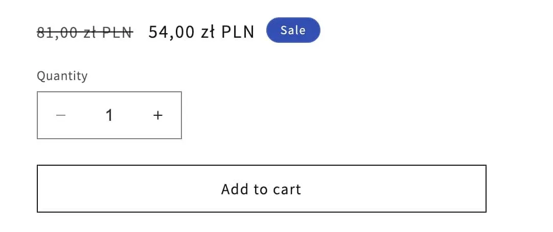
There is a standard way of showing sale prices in Shopfy themes. The new price becomes the ‘real’ price and the old price (the compare-at price) gets crossed out.

This works well. But you may want to add emphasis to this saving. Either by showing something like:
“YOU SAVED $25.00!”
Or:
“20% OFF!”
Here is an example on gymshark.com:

Some Shopify themes have this feature, but Dawn and all the free Shopify themes currently do not (as of November 2023).
Luckily it’s pretty quick and easy to add using your themes Custom Liquid block, and with some simple math we can display either the dollar value or a calculated percentage.
The following code all goes in the Custom Liquid block. There is nothing that you need to add to your theme code.
Note: This tutorial assumes your product variants are all the same price (e.g. color options). Unfortunately, if you have differently priced variants things get a lot more complex, so I won’t be covering that here.
Dollar value saving
This is easy. It’s just the compare_at_price minus the current (discounted) product price.
{{ product.compare_at_price | minus: product.price | money }}But let’s wrap it in an {% if %} statement so that we don’t output anything if the product is actually not on sale.
{%- if product.compare_at_price > product.price -%}

<p>YOU SAVE {{ product.compare_at_price | minus: product.price | money }}</p>

{%- endif -%}
Notice the last part of the line where it says 'money'. That lets you change the way the price appears:
moneylooks like: $10.00money_with_currencylooks like: $10.00 USDmoney_without_currencylooks like: 10.00money_without_trailing_zeroslooks like: $10
If you don’t use any of these, the product price appears in its raw form e.g. ‘1000’ for $10.00.
Percentage saving
Almost the same as before, except we change the calculation in the main part of the code:
{{ product.compare_at_price | minus:product.price | times:100 | divided_by:product.compare_at_price }}% OFFPretty self-explanatory if you read it, but order of operations is just left to right in liquid (unlike real math). So e.g. 30 - 20 * 100 / 30 = 33%
Here is the full code again, but with percentage this time:
{%- if product.compare_at_price > product.price -%}

<p>{{ product.compare_at_price | minus:product.price | times:100 | divided_by:product.compare_at_price }}% OFF</p>

{%- endif -%}
Adding some styling
- Add
<style> </style>tags below your liquid (in the same custom liquid block). - Add a class to your
<p>element so you can target it with CSS. Here I’ve called mine “savings-amount”. - Add your CSS between the
<style>tags. Here’s how your complete code will look:
Grey square style
YOU SAVE $10.00
{%- if product.compare_at_price > product.price -%}

<p class="savings-amount">YOU SAVE {{ product.compare_at_price | minus: product.price | money }}</p>

{%- endif -%}

<style>
.savings-amount {
  background: #F5F5F5;
  display: inline-block;
  padding: 3px 10px;
  margin-top: 0;
  margin-bottom: 0;
  font-weight: bold;
  font-size: 12px;
}
</style>
Green badge style
YOU SAVE $10.00
I know many will prefer a more rounded, green “badge style”, so here’s alternative CSS you can use for that:
.savings-amount {
  background: #00796b;
  color: white;
  display: inline-block;
  padding: 5px 10px;
  border-radius: 40px;
  margin-top: 0;
  margin-bottom: 0;
  font-size: 12px;
  font-weight: bold;
}
Removing the ‘Sale’ badge
Now that you’ve added the savings amount, you might want to remove the default Sale badge. Otherwise things end up looking a bit cluttered there.
Here are the instructions for disabling the sale badge for Dawn-based themes:
- Go into your theme code editor and open up
main-product.liquid. - Look for the line that says
{%- when 'price' -%}this is line 99 in Dawn version 11. - A few lines under that you should see
render 'price', and below that a line that saysshow_badges: true, - Change this to
show_badges: false, - Save.
